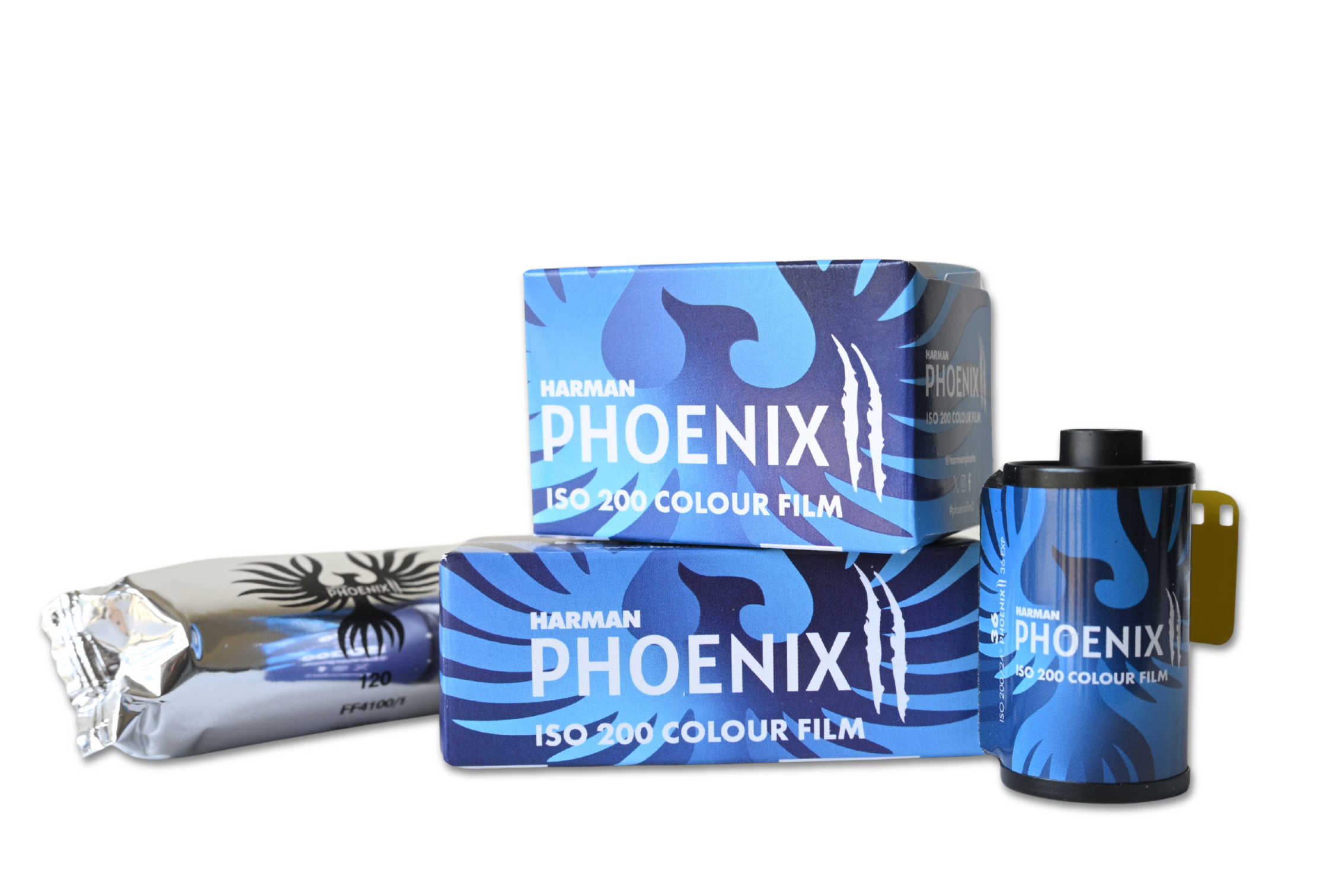
In December 2023 Harman released their first colour film, Phoenix 200. They had a long drawn out campaign on social media in the months building up to the release which got the film community excited in anticipation! And when it landed it got a mixed bag of reviews with many loving what Harman had done.
Well, it’s the 16th July 2025 and they have just released Phoenix II and Harman sent me some rolls to test out. So I did! And I asked Harman to develop the films for me. And here are some of the scans from three rolls I sent in including a roll of original phoenix so I could compare.
See the SFLaB Video here
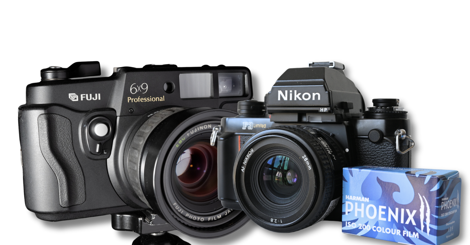
Eager to see how this new emulsion performed I set off with a Fuji 6×9 camera and for 35mm the Nikon F3. And from my results I wanted to see –
- Colour Vibrancy and Rendition
- Grain
- Sharpness
- Dynamic Range (Ratio between light and dark)
35mm
On a light overcast morning I went to the beach and purposely chose bland looking scenes. Colourful scenes come later.
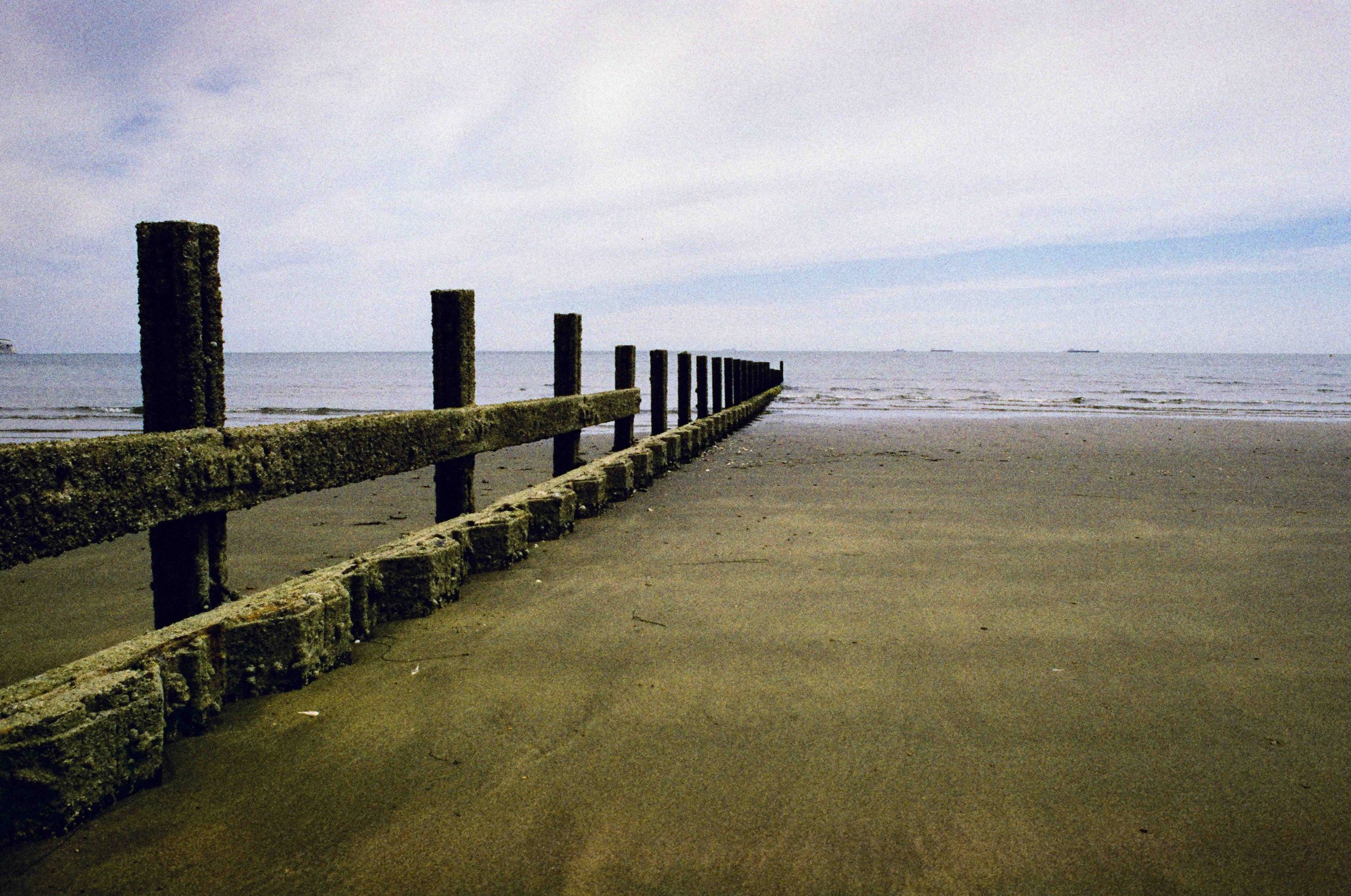
So this was one of my first 35mm photographs. I knew the sands looked more browny sand and unless I am going colour-blind, to me this looks more of a hue of green. Harman scanned this no doubt on a default setting. And below is a screen grab from the GoPro I was using the make the YouTube Video.

After a bit of tweaking in Photoshop and I got a photograph I was pleased with. All I did here was highlighted the sands in the middle section and burned the bottom area. And a slight cooler temperature tweak to take the green away. (If it is green!).
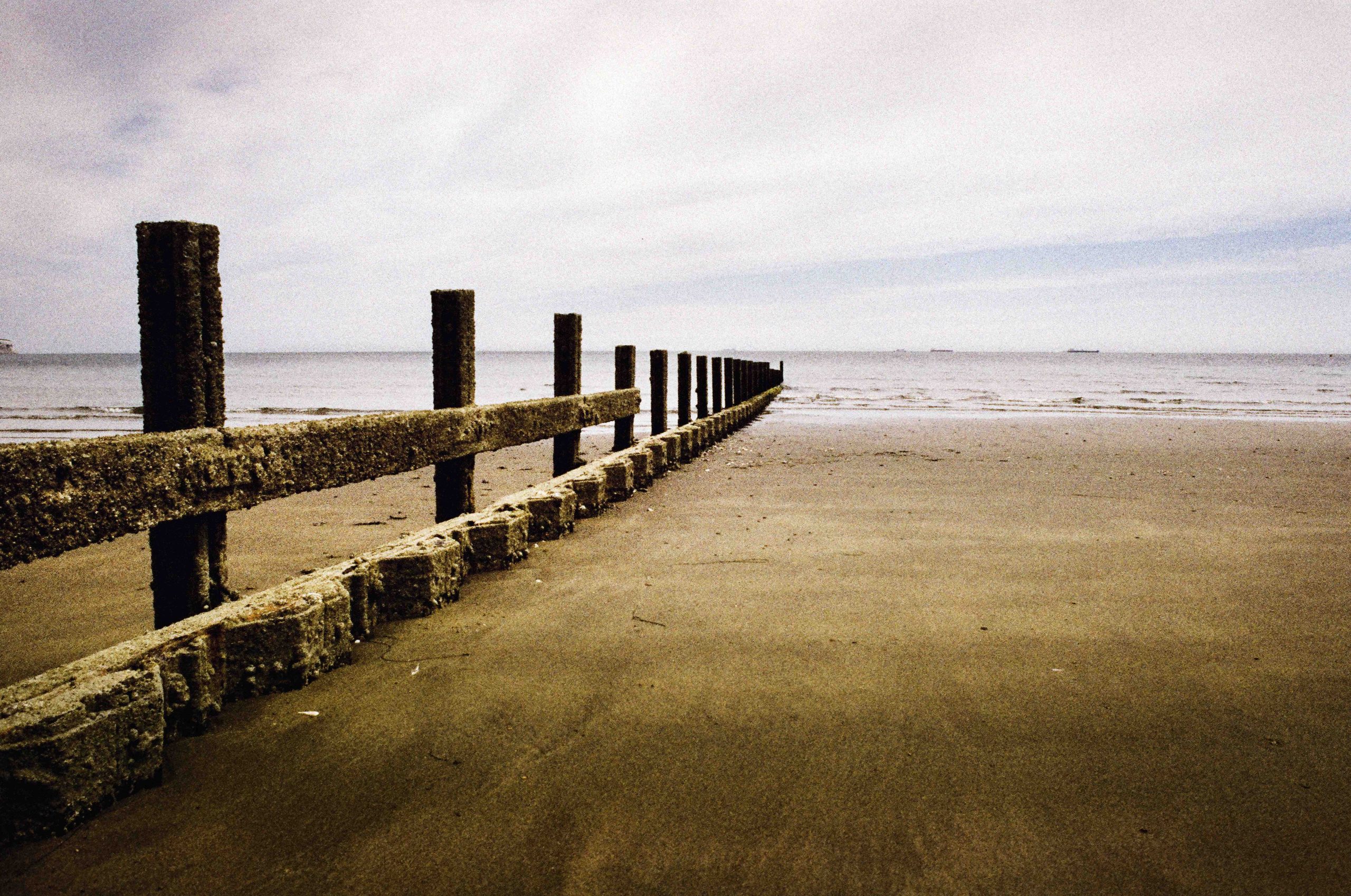
I would be happy to print this photograph especially if I could manage the same in the darkroom.
Skin Tone
I took this photograph purely for skin tones. And I have tweaked it in Photoshop to get the colours I like and I am really happy the way this turned out.

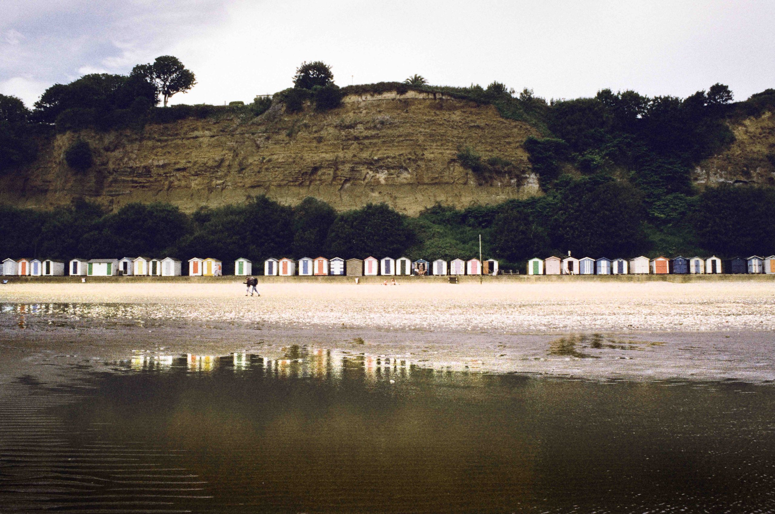
Next is a photograph of beach huts with their reflection in a water hole. Again, I have tweaked this photograph to my own taste with a bit of de-saturation and exaggerating the highlights (dodging) the hut reflections.
Colour
Aiming for some colour now I spotted these vibrant red deck chairs. This photograph was pretty much straight from the scan. As are the rest of these photographs.

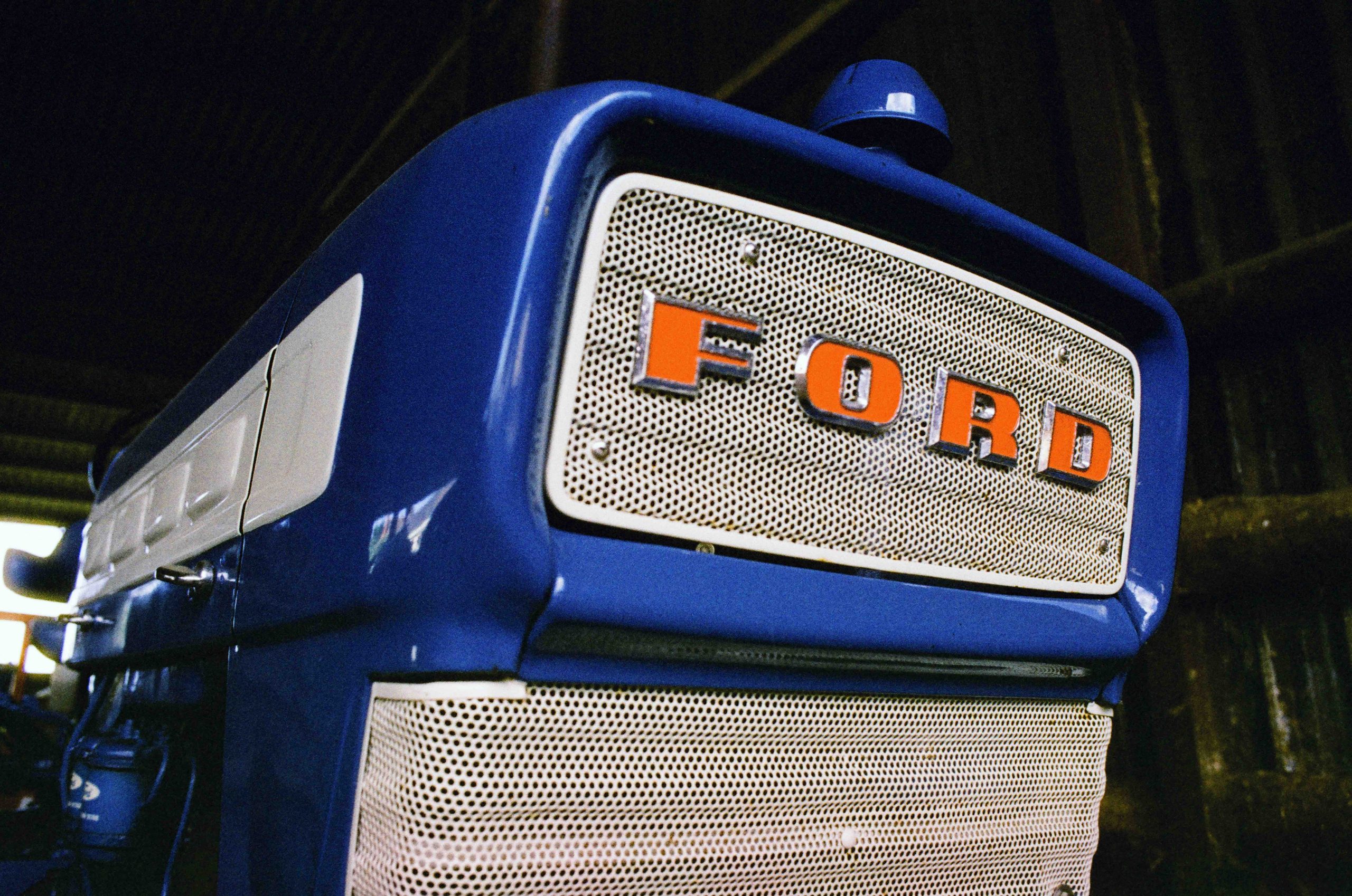
Coming away from the beach I went to the farm for some more colour. Just look at this blue tractor. It’s an amazing electric rendition of colour, the red Ford badge a bit more subtle. Just like the red deck chair.
Highlights
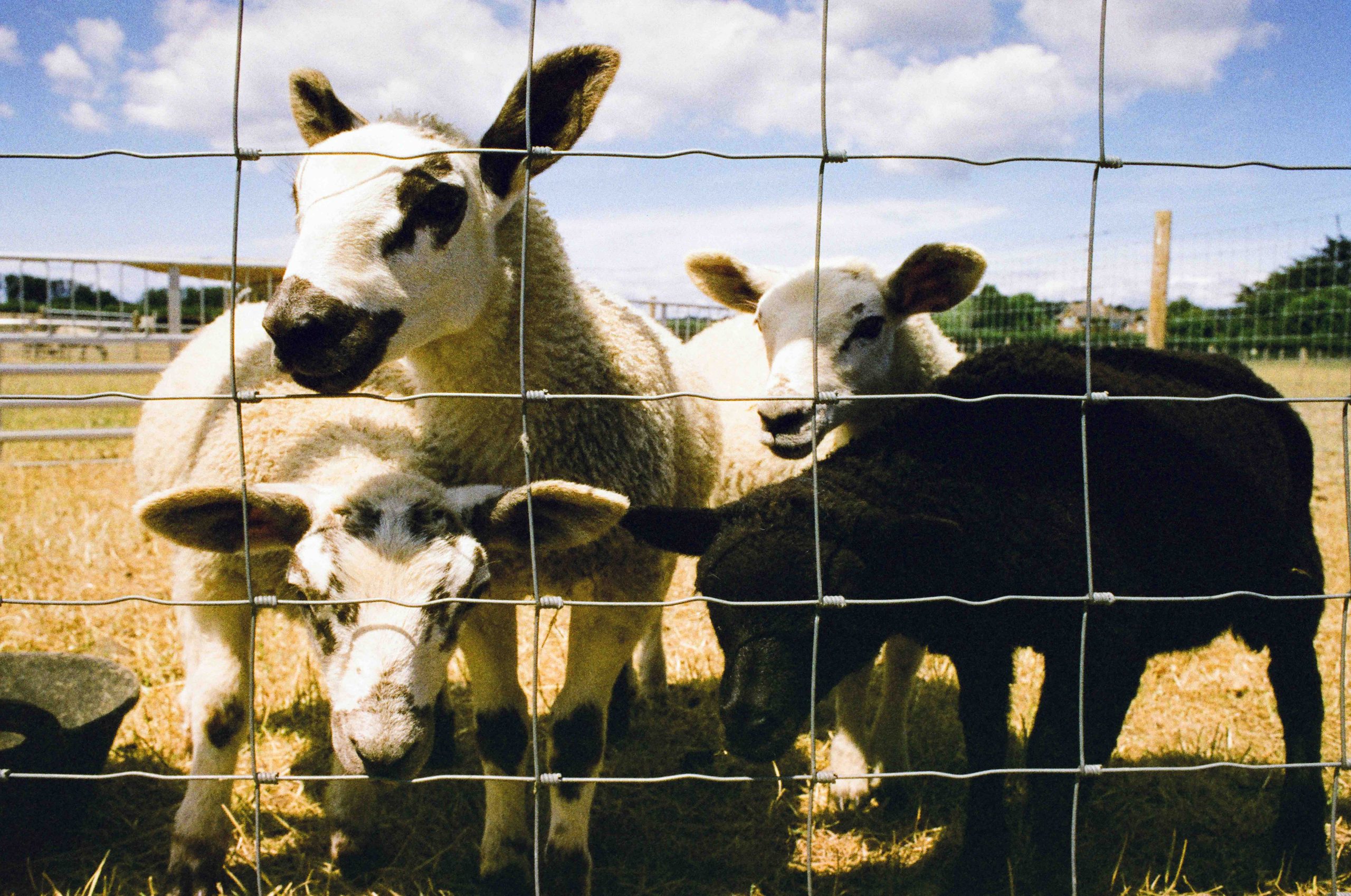
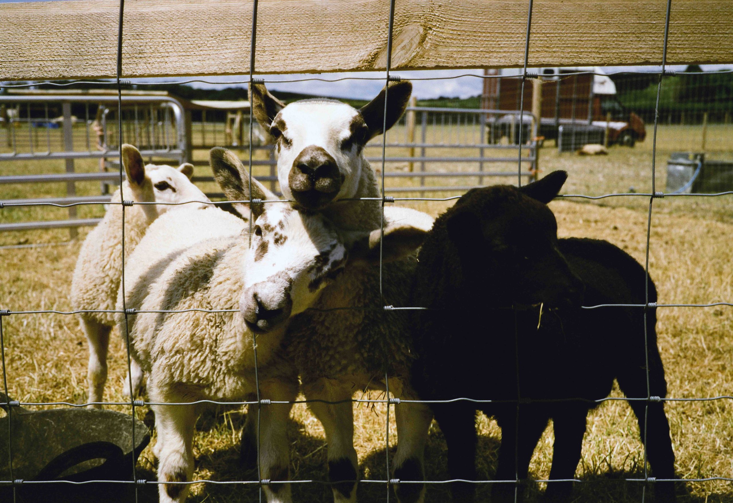
This is where things got tricky. The F3 it has an awesome metering system and I was shooting Aperture Priority. It was a bright day and I was hoping for better highlights. I’m not surprised I got little detail on the Black Lamb.
And back on the beach I couldn’t help but notice the bloom on the bright yellow sun umbrella, but again, check out those blues!

And I particularly like this photograph. It’s got that nostalgic colour film look with a hint of Phoenix quirkiness to it and the colours warm and vibrant.

So far the photographs above show the variance in vibrancy and I think the film mostly done a good job dealing with the bright scenes (and flat scenes). I noticed a difference in grain between the original Phoenix and this new version. The Phoenix II being a finer grain. Which will be welcoming to many.
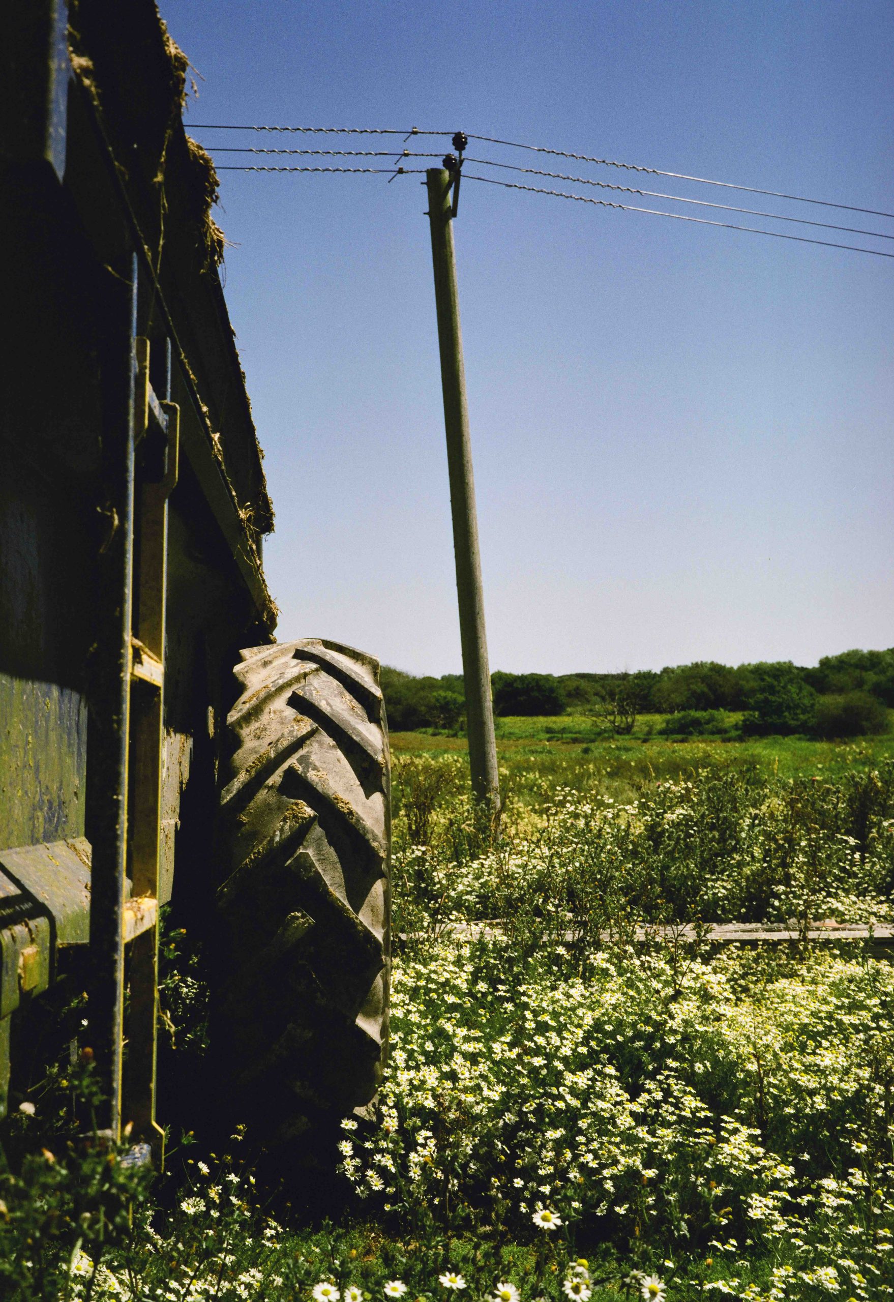
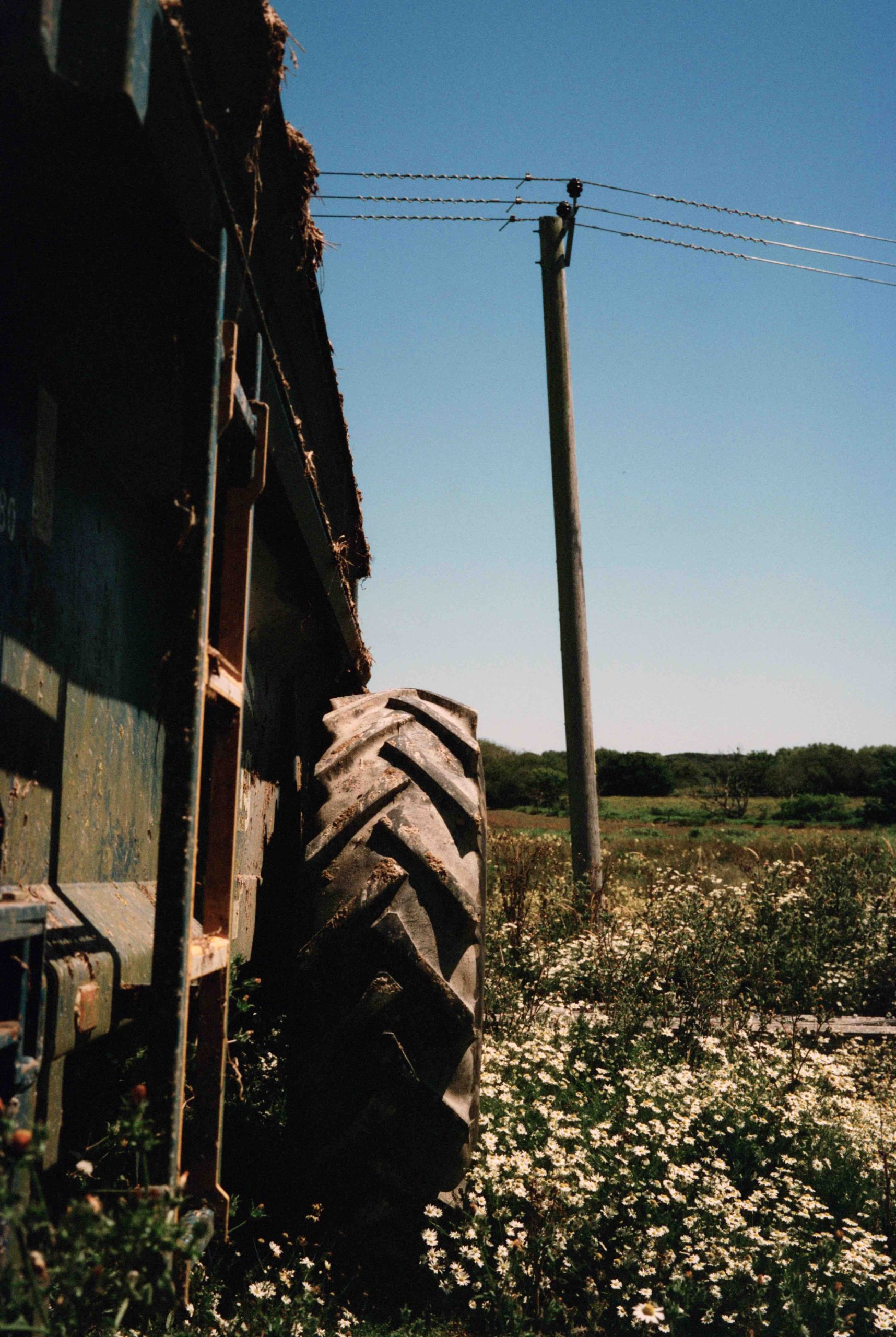
6×9 120 Film
I was really excited to see my results from the Fuji 6×9 camera which I shot at the farm.

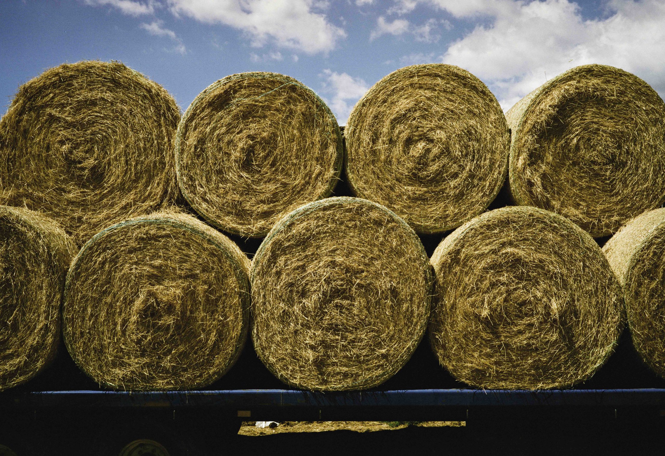
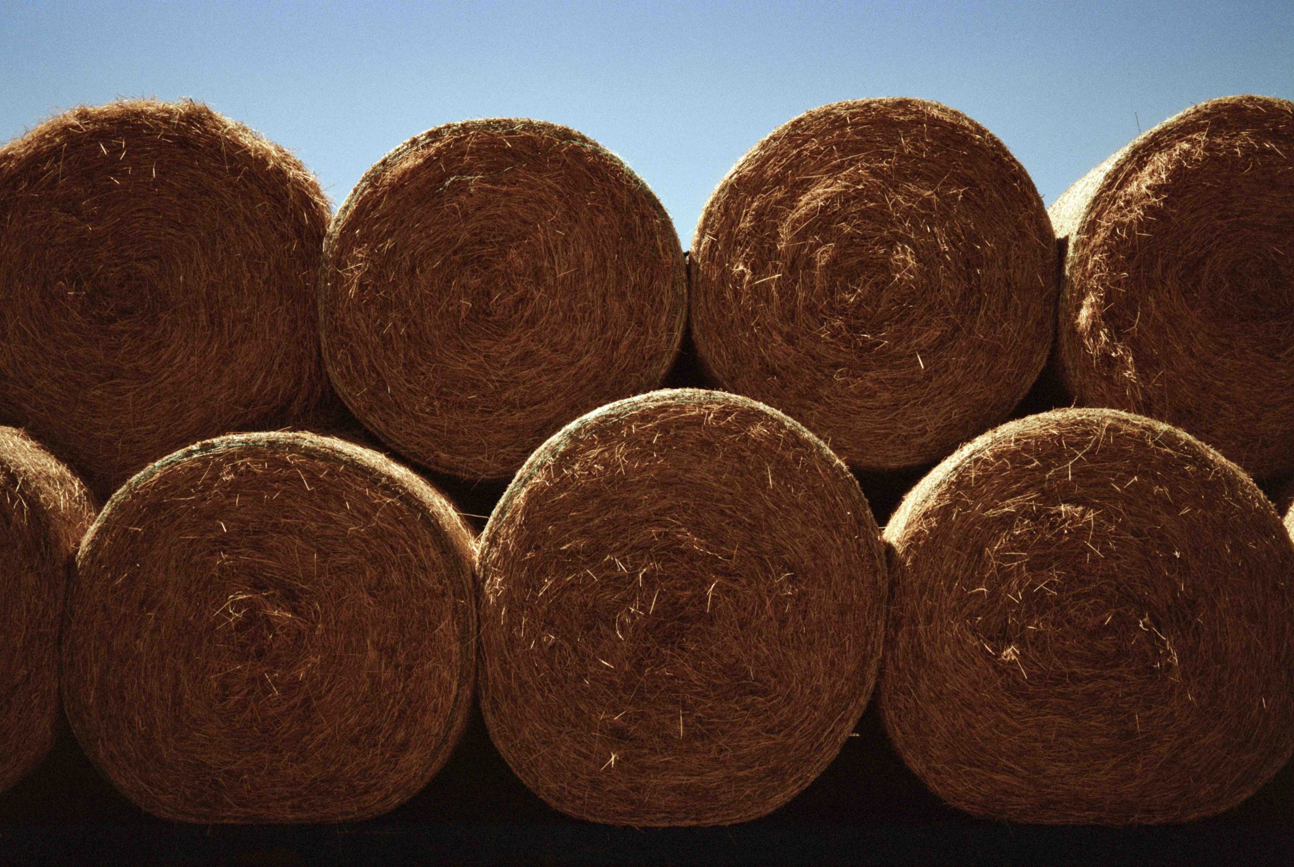
This haystack photograph was on Phoenix II, but I also shot the same scene on the original Phoenix and I noticed a big difference with the Phoenix II the clear winner.
Green!
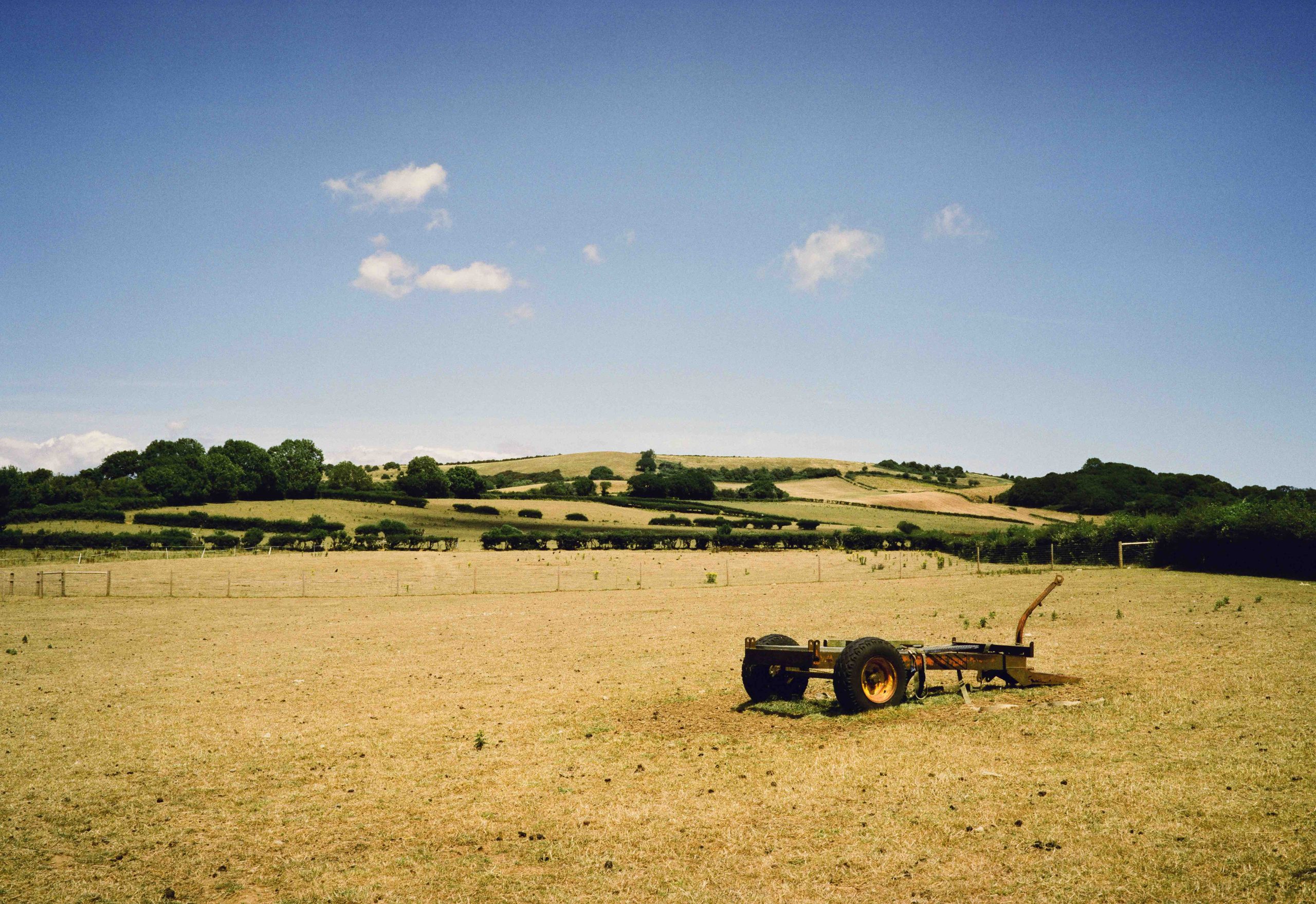
And this farm scape below surprised me. The grass looks more green when in fact it was actually brown from the recent heatwave. The original Phoenix got this more precise. However, the Phoenix II wins on the finer grain!
And back to the cute Lambs. Still pretty bright on the highlights, but as I said it was a super bright sun!
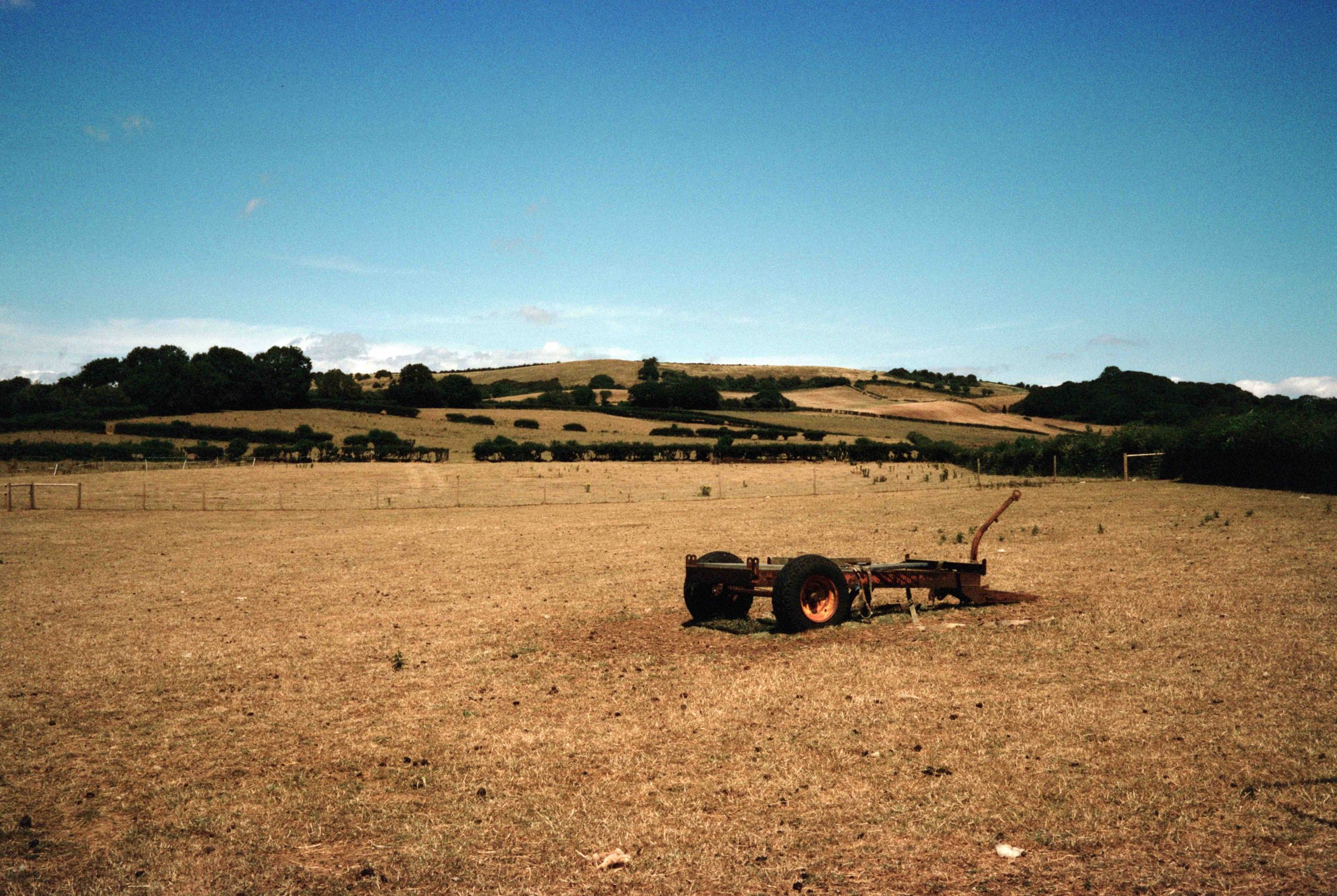
And finally another surprise between the two films. Both 6×9. The first is the Phoenix II and I noticed how lush the greens were. Certainly not what I saw! And underneath is the original Phoenix which appears to get the greens more precise. Yet the sky appears correct on the Phoenix II.
Conclusion
When Harman released Phoenix I was one of the first to try it out and for all it’s – I wouldn’t say flaws, I would say it’s difference from other colour films, I actually liked it. What’s the point in shooting a colour film that is so good you can’t tell the difference between it and digital? And what’s the point in shooting a colour film that is just as good as another branded colour film? I liked Phoenix because of it being different. Crunchy, Grainy and quirky! And I am pleased to see Phoenix II has not lost that identity. To me it’s still quirky and crunchy but less grainy. That is, of course, from what I have seen from the two rolls I shot in the conditions available to me at the time.
So if you are into colour film photography grab a few rolls and see how you like it.